 A successful landing page not only helps you gather information on leads but also proves your company’s value, provided you have put sufficient effort into making your offer a quality one.
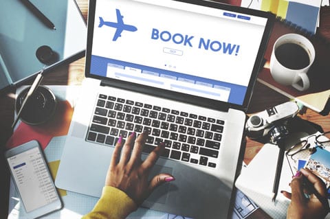
Vital to your website’s conversion process, landing pages are single pages tailored to entice visitors into partaking in a specific offer. User experience (UX) is integral to the success of a web page; poor UX can send a visitor away before they even know what you’re offering.
It’s important to know all the best UX practices for landing page design.
Common Practices
Before we dive into the different elements that make up a lead capture page, let’s go over seven general tips that enhance the user experience on landing pages:
1. Give a Sneak Peak
You’ve made a great offer, so you should have nothing to hide, right? Try giving visitors a preview to showcase the value of it. One way to do this would be by publishing an excerpt as a blog and linking that blog to your landing page.
2. Keep The Focus On Your Offer
There should only be one option for where to go after your landing page, and that’s straight to your offer, so remove your navigational menu from the header. You’re trying to get visitors to take a specific action so don’t distract them from it with other options.
3. Have An Even Trade-Off
Visitors are quickly turned off by long, complicated forms. Forms should be easy to fill out, and the information you ask for should be equal in value to the offer you’re providing.
4. Do A/B Testing
Don’t forget about your landing page once you’ve created it. Make different versions and see which one performs better. Just be sure only to make one small change at a time, or you won’t be able to tell what’s working best.
5. Keep It Simple
Don’t crowd your page with too many visuals, text, or other elements. People will exit out of a page if it’s taking too long to load. If design slows the page down, you’re hurting your chances of conversion.
6. Add Social Proof
A well-worded review does wonders for convincing visitors to take action. The more information you can share about your reviewer, the better; adding their name, job title, and picture adds authenticity and authority.
7. Utilize Videos
Explainer videos are particularly helpful for proving value. By adding a video, you can keep your copy short and sweet while going into more detail about your offer.
Keep the above tips in mind as you blend copy, design, and calls-to-action to create an experience catered explicitly to the user.
Design
Design isn’t something that only artists need to consider. In fact, design plays a significant role in usability and function on the landing page:
- Fonts. Choose big, simple fonts in all of your copy to ensure optimal readability.
- Text. Aim for all your copy to fit above the fold, or at the very least make sure your CTA is above the fold. You’ll want to place your CTA at the end of your text below the fold, too, so your visitor doesn’t forget to take action.
- Logos. Be sure to include your logo on the top left or right of your page. It should be crystal clear to the visitor which company is providing the offer.
- Branding. Make sure your color scheme and other design elements stay on-brand with the rest of your site; all your pages should look like they go together visually.
- Responsiveness. Check how your website looks on different displays; some people have older devices which will have different resolutions than newer ones. Good design should look the same across all devices.
- Graphics. Only use graphics that relate to your offer. Don’t overcrowd your page with distracting visuals.
Copy
Because of its simplicity, even the smallest bit of text on a landing page has a substantial effect, so it’s important to get it right.
Use Relatable Language
Speak to your readers in a way they’ll quickly understand; don’t resort to technical jargon in order to sound smart.
Don’t Focus on Your Company
This page is about the offer, and the offer only. Resist being self-promotional and instead focus on the features and benefits of what you’re offering.
Be Concise
Too much text is hard to digest so avoid writing in paragraph form. Be brief about your offer and make sure it’s easy to understand. Use bullet points and bold text to get your point across to readers quickly.
Create Clear, Interesting Headlines
Headlines are the first thing someone reads on your page, so make sure they’re both interesting and clear. Your reader should be able to tell within seconds of looking at your page what your offer is about.
Promote Instant Action
It’s human nature to put things off until later, but when visitors exit your landing page you risk having them forget about your offer and never returning. Convince people they need to take you up on your offer immediately by using urgency or scarcity. Utilize words like “today” and “now” to elicit a sense of urgency, or place an expiration on your offer to give off the illusion of scarcity.
Calls-to-Action
Calls-to-Action or CTAs are arguably the most essential part of a landing page, as they lead visitors to your offered content:
- Make It Click-Worthy. Your CTA button should be just that: very obviously a button. Leave no ambiguity about whether it’s functional or just for design. Flat CTAs don’t look like buttons, so make use of gradients, shadows, and bevels to get the desired effect.
- Grab Attention. Your CTA should stand out from the rest of the page. Try using contrasting colors and large sizes to ensure your visitor doesn’t miss it.
- It’s All About the Verb. Ensure it’s apparent to the visitor what will happen once they click on the CTA. Use verbs (download, subscribe, request, etc.) followed by exactly what your offer is for clarity.
Though they may be simple, your landing pages shouldn’t lack strategy. Follow these best practices, and you’ll be well on your way to delighting users and capturing leads.