 Early on in Q1 2017, I had an “aha!” moment. Our website didn’t resonate… but we had the opportunity to change that.
It happened right around the time I wrote F Google, Write for Humans, my entry in the “Battle of the Blogs” we launched at the beginning of the year. Our traffic was falling, and bounce rates were increasing. We needed a way to make our content stick. That’s where the content experiment came into play.
In my entry, I hypothesized that we needed compelling, engaging content written with humans in mind (and less focused on a keyword strategy) to see organic traffic grow. Writing about having human-focused content made me realize it wasn’t just our blog that needed a new approach. Our website did, too.
We were losing traffic, losing engagement. Something had to change. So, we set out to redesign our website for the third time in as many years.
But this redesign was a little different. Having relied on traditional website redesign methods in the past, this was our chance to try Growth Driven Design (GDD).
What is Growth Driven Design?
Growth Driven Design is all about optimizing the redesign process. Instead of building a site based on guesswork and assumption, GDD uses an agile, analytics-focused approach to website design.
Avoiding the pitfalls of traditional web design and the “set it and forget it” mentality, GDD focuses on real impact in a shorter launch time. Once the site launches, the process keeps going.
With continuous user experience (UX) research and testing, you can learn about your site visitors and how they interact with each page. Through GDD you make smarter, data-backed decisions to continuously improve your site.
We wanted to keep the user at the center of our website redesign, and GDD was the answer. To test it out, our strategy was to engage users, simplify navigation, answer questions and have fun.
1. Engage
One of the driving forces of our redesign was engaging users.
We knew our bounce rates were up, making it pretty clear that our site wasn’t resonating with visitors. Using the GDD approach, we let the bounce rate data guide our design concept for the Home page – simple and straightforward. Here’s what we came up with:

In the month since our redesign went live, all of our engagement metrics have improved. Our bounce rate is down, and more users are engaging with the site content.
As an added bonus? Our traffic has increased, too. Mobile sessions alone are up 52 percent.
2. Simplify
Our goal is to drive users to the information they’re looking for more quickly. A clean design with easy navigation is just one of the ways we hope to accomplish this.
Before the redesign, our site navigation was the definition of information overload.
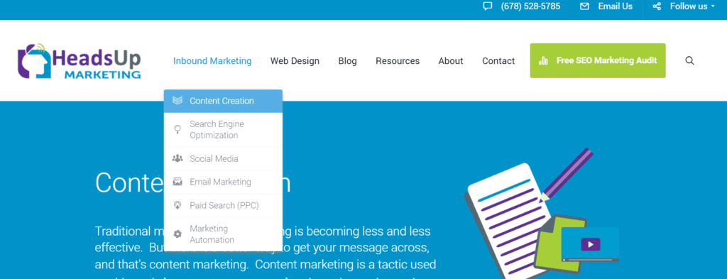
There were pages, sub-pages, and sub-sub-pages… all on display within the navigation! No wonder our bounce rate was suffering. The design might have passed a blink test, but the site menu was overwhelming and tough to navigate.

To make it easier to use, we made a few decisions. First, we morphed the Blog page into our Resources page. We also added a Services page that describes all our offerings, eliminating the confusing drop down menu altogether. As a final act of decluttering, we removed the content offer from the menu as well.
3. Answer
Why do people go to websites? Most of the time, they’re looking for information.
With that in mind, we stopped thinking of our service pages as an opportunity to showcase our capabilities. Instead, we started to consider what each page might look like if it was answering visitor queries and offering up valuable information.
If we wanted to provide answers and information, first we needed to ask questions. Early on in our redesign process, we sent out a small feedback survey to clients, friends and supporters. It was a way for us to determine how effective our design changes were, while also making sure the content was up to snuff.
With the survey responses in hand, we then built each page with a similar formula – define the service and how it helps, present visual statistics, and display our top blogs written on the subject.

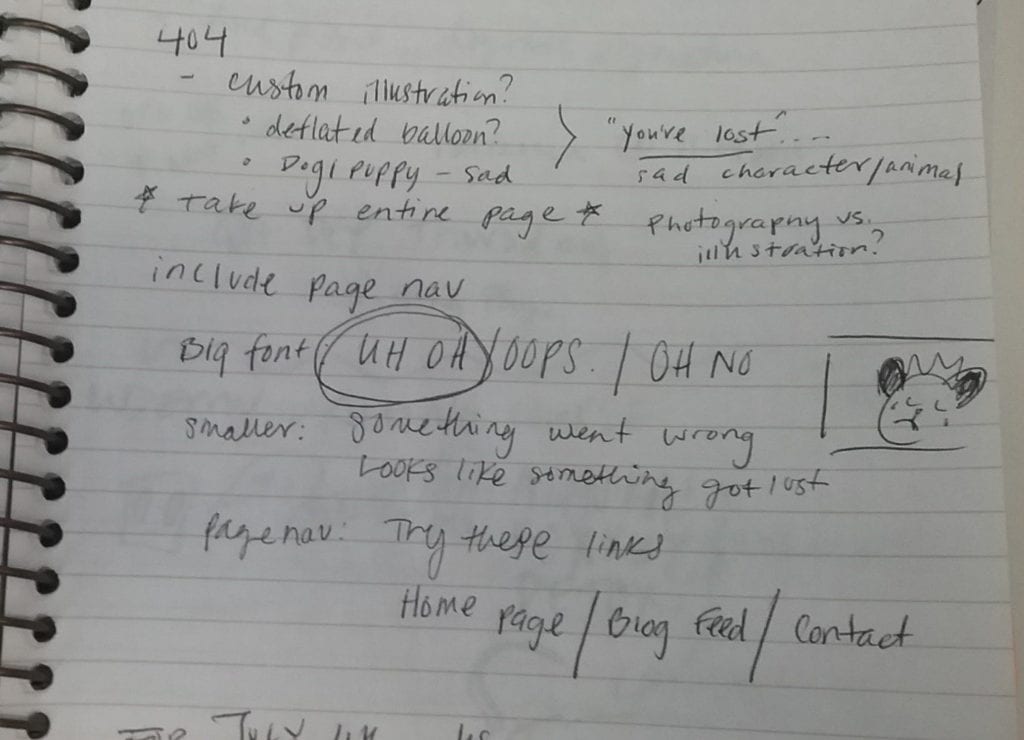
4. Have fun
HeadsUp is a creative growth agency. At our very core, we’re human. With this redesign, we wanted to have some fun, adding elements that were unique to us.
These are the notes our initial design meeting. They’re a bit disorganized, but that initial meeting gave us the foundation we needed.
Once the concept had been decided on, we spent a chunk of time looking at cute animal pictures on 123rf and writing up the page copy. Then we built the page. Here’s what the final product looks like:
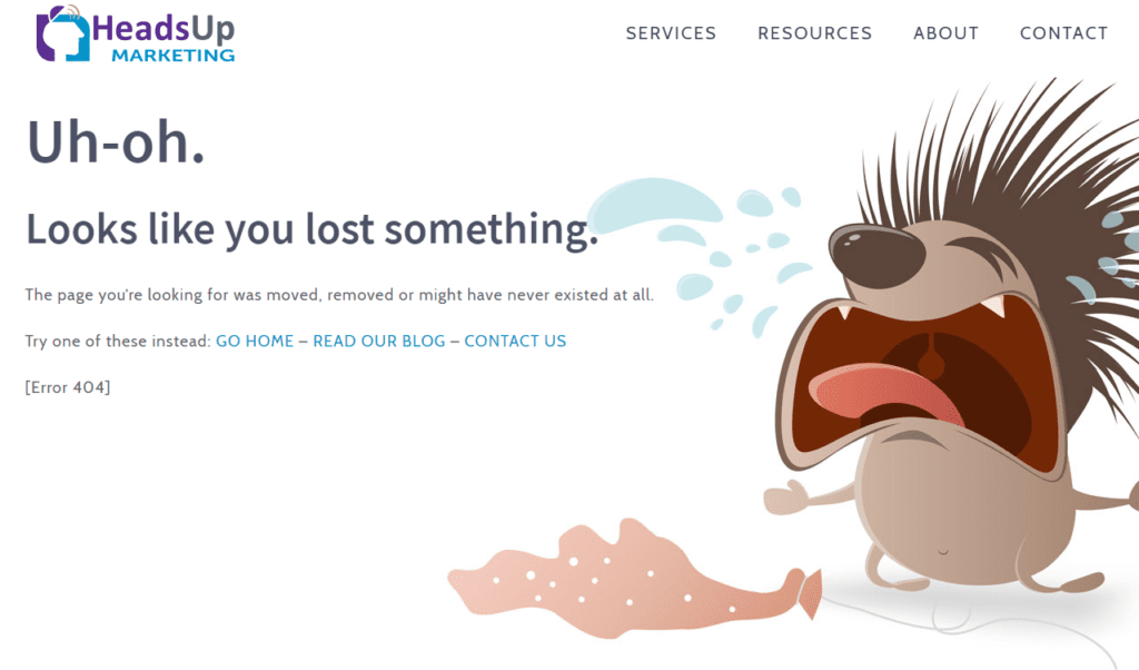
It’s pretty great.
The bottom line
For us, Growth Driven Design is just one part of our marketing efforts. Making monthly website changes simply won’t deliver long-term results. It’s when you fuse GDD with a strong inbound strategy and add in plenty of user-focused content that you start to see lasting results.
With this launch, we can engage users with our simple navigation and pages that offer real answers, while also staying true to the creative, fun side of HeadsUp – and it is due in part to Growth Driven Design.