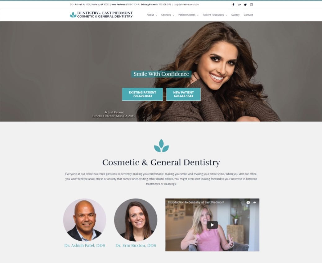
 Imagine if websites stayed the same forever; there would be far more comic sans and dancing hamster GIFs sprinkled across the web. As technology advances, it’s vital to the success of your website to optimize for these changes.
An effective website redesign solves for both form and function, creating a seamless user experience. Website visitors have the potential to turn into leads, and eventually new customers, so it’s crucial to make a good impression right off the bat.
These tips will help you tackle your next redesign and impress every visitor:
1. Page Load Speed
Pages need to load quickly from both a user and an SEO standpoint. Not only does Google take site speed into account for their ranking system, but every second of load time can make a difference on whether a user decides to wait for your site or abandon it entirely.
- Select a simple design theme. The more elements you have on your page, the longer it takes to load, so limit your plugins and widgets.
- Choose a reputable web host service provider. If a web server hosts too many websites for its capacity, load times will suffer.
- Insert background images as part of your external CSS rather than as their own images to help them load more quickly.
- Optimize your images for web by saving photographs as JPGs and moving images as GIFs.
Once you’ve applied the above suggestions, use an outside tool like SEMRush to test your site speed and make sure the pages are loading quickly.
2. Clear Copy
Web copy is essential to selling your product or services and convincing readers of your value. Always keep your buyer personas in mind when writing your website copy to ensure your content will be well-received by your target audience.
- Don’t use industry-specific jargon. Speak to your readers in a language they will understand. Technical terms should only be used if your buyer personas are well-versed on the topic.
- Organize your content appropriately with titles, headings, and subheadings. Your readers should know exactly what to expect from each specific section.
- Utilize calls-to-action (CTAs). Use action-oriented language to persuade your readers to take the next steps so that they not only read your content but interact with it as well.
- Keep it short and sweet. People are busy and want to as much information as possible quickly, so don’t overload them with too many words. Utilize numbered lists and bullet points for easily scannable information.
- Most importantly, stay true to your brand’s voice and be consistent in your writing. Your site visitors will take notice!
3. Professional Look
Your website’s design is the first thing visitors notice, so it’s essential that it looks polished. Just as you dress your best for a job interview, you’ll want your website to look professional, so visitors know your company is qualified.

The best way to avoid an amateurish design? Keep it simple with clean lines, complementary color schemes and consistent fonts.
4. Ease of Navigation
After your website attracts visitors, your navigation bar will tell them what to do next. The navigation should be intuitive and act as an outline for the viewer. Ensure the sections of your navigation menu are clearly labeled and leave no room for interpretation about where they lead.
- Place your navigation bar at the top of your site in the header, and hyperlink your logo to your homepage.
- Order your navigation menu from most to least important, as visitors are more likely to click on the first thing they see.
- Utilize anchor text and jump links to allow your reader to easily find the sections they’re interested in, as well as go back to the top or bottom of the page without having to scroll.
- Eliminate drop-down menus. Not only do search engines have difficulty crawling them, but they can also distract users from visiting an important page.
Easy navigation is essential. Otherwise, you risk losing visitors before they get to the most substantial parts of your site.
5. Responsive Web Design
Gone are the days when people strictly relied on desktop computers for research. With the ever-growing popularity of smartphones and tablets, information is now available at users’ fingertips. If you don’t optimize for every platform, you lose a huge demographic of people who would otherwise be interested in your site.
- Modify the desktop versions of your pages so they load quickly on small electronics. If you aren’t savvy in web design, consider using a pre-made template that works for all devices.
- Ensure your buttons and navigation menus are large enough to be clickable on smaller screens such as phones.
- Test each page for different devices. Certain web hosts like HubSpot allow you to preview your design for multiple platforms before publishing.
Trends and technology in website redesign are frequently changing, so it’s important to audit your site and make changes continuously. By taking these aspects into account, users are sure to have an enjoyable experience on your site.
Editor’s Note: This post was initially published in December 2015 and has been updated for clarity and accuracy.
